In 1988, while I was studying in Florence for my Master in Art History, the most extraordinary privilege was visiting the Sistine Chapel in Rome as it was being restored. Climbing up the scaffolding and discovering Michelangelo’s ceiling about fifty centimetres from my eyes was an experience I will never forget.
After many disastrous attempts, restauration techniques were elaborated to free the fragile *frescoes from four centuries of grime. These techniques had been tested in 1966 in Florence after a horrific flood damaged great quantities of architecture, art and books. More importantly, in 1980, an unlikely yet shrewd sponsor was found: Nippon Television Network Corporation. 4.2 million dollars were forked out across twenty years; in return, the sponsor got exclusive rights to all images, photographs, videos and publications to last at least the time it took to restore the murals.
*Fresco (plural frescos or frescoes) is a technique of mural painting executed upon freshly-laid, or wet lime plaster. Water is used as the vehicle for the pigment to merge with the plaster, and with the setting of the plaster, the painting becomes an integral part of the wall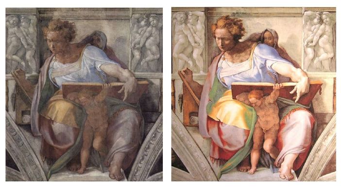 One of our Professors at University, Gianluigi Colalucci was head restorer for the Sistine chapel project. Close examination by his team revealed that apart from smoky deposits, seepage deposits and structural cracks; the thin “pictorial skin” of Michelangelo’s frescoes was in excellent condition. Most of the paint was well adhered and required little retouching. The plaster, or intonaco, on which the paintings were executed, was found, for the most part, to be secure.
Renaissance Masters had extraordinary knowledge of the materials they used and how they would evolve over time. Egg tempera for example, when properly laid on an suitable surface, is one of the most resistant materials ever. Likewise, frescoes, albeit extremely simple in concept, depend, for their stability and longevity, on materials that do not fight each other. A wall, made with stone or brick, mortar and river sand, later covered with wet lime plaster, is a porous surface. Adding colour from pigments and water on it is an idoneous gesture. As in any place of worship, the Sistine Chapel frescoes suffered from black greasy residue emanating from wax candles burning night and day for centuries. Greasy wax tends to darken and clog. Over time, as the ceiling and walls were becoming dark and lifeless, 17th and 18th century restorers “cleaned” the frescoes using wine, and “revived” the colours using glue resin. Thus completely clogging a surface that needs to breathe. Slowly, the varnish dried, cracked and peeled, taking with it the thin layer of paint.
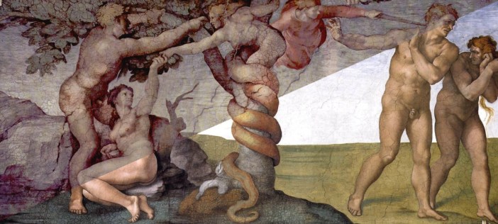
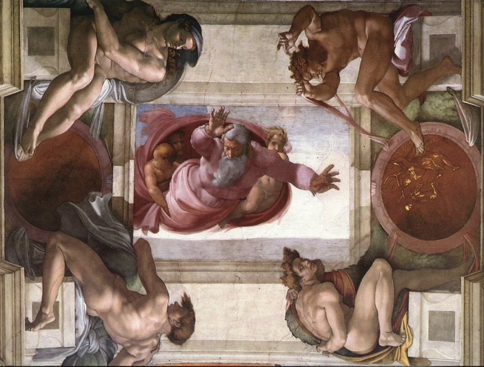
Originally commissioned by Pope Julius II, it took Michelangelo approximately four years to complete the Sistine chapel (1508 -1512). When not interrupted by other pressing Patrons, Michelangelo, high up on wood scaffoldings, would paint night and day. Helped by a coterie of young assistants, he would frenetically execute his personal vision of the Book of Genesis: basically lots of strangely muscular naked men gallivanting with strangely muscular naked women who look like men. As Michelangelo would only wear leather trousers, (not so out of the ordinary in those days) and really, really did not like bathing often, (also not so out of the ordinary in those days, unless you live in France these days). Thus, after long periods of work, sweat and intense amorous distractions, he had to bathe in extremely hot water, so as to peel off the leather that clung to his skin.
20.7 metres (68 ft) high, 40.9 metres (134 ft) long by 13.4 metres (44 ft) wide, may not sound huge by today’s standards. But, as anyone who paints knows, proportion is one of its more daunting aspects. It is hard enough getting it right on paper or canvas; getting it right on a 40 by 13 meter wall, 20 meters up on a rickety scaffolding is insane. No elevators, no getting up or down easily, and certainly no getting down for a quick peek to check if Adam and Eve look okay. Fresco in Italian, means fresh, it entails, as written earlier, applying the colours rapidly, on a fresh coat of wet lime plaster, before the surface dries. It’s a humid, cold and exhausting job.
So here I am, more than four hundred years later, heart pounding, going up a state-of-the-art aluminum scaffolding with motorised rubber wheels. I am greeted by a studious group of men and women wearing white Doctor’s blouses and plastic goggles. Around them, small buckets contain a water-based solution. With the help of a Sea sponge, they tap on the paint surface who comes alive in rich color. The water-based solution is meant to ever-so-gently dissolve the layer of black grease from candles and varnish. With Q-tips, the fresco restorers softly swipe the humid surface and gently rub out the dirt. Others, helped by the tiniest point of a scalpel, grate reticent hard grime. As I look up and take a moment to register what I am experiencing, I discover traces embedded in the wall of Michelangelo’s original disegno. He would quickly mark the layout of his idea on the fresh plaster with the wooden top end of a brush. Keep in mind that when he started Adam’s head, he had no way of doing the rest of the body in immediate sequence. Getting the proportions right was purely based on his own sense of it, his own inner music. I can actually see where his vigour has taken liberties with the original contours. His light, yet rapid and precise brushstrokes are clearly apparent. The rediscovered colour palette, from soft pastel hues to exuberant acid tones enchant my soul as I gaze open mouthed. It is as if it had been painted just days before my visit.
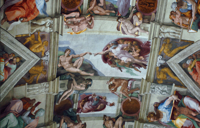
To be in awe finally finds its true meaning here. Overwhelmed by the brilliance of execution and moved to tears by the life changing, but, alas, fleeting moment of intimacy with pure genius.
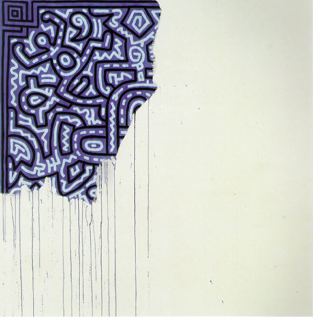
, 1982")
, Eggs, 1982, acrylic and silkscreen ink on linen, 228.6 x 177.8 cm")


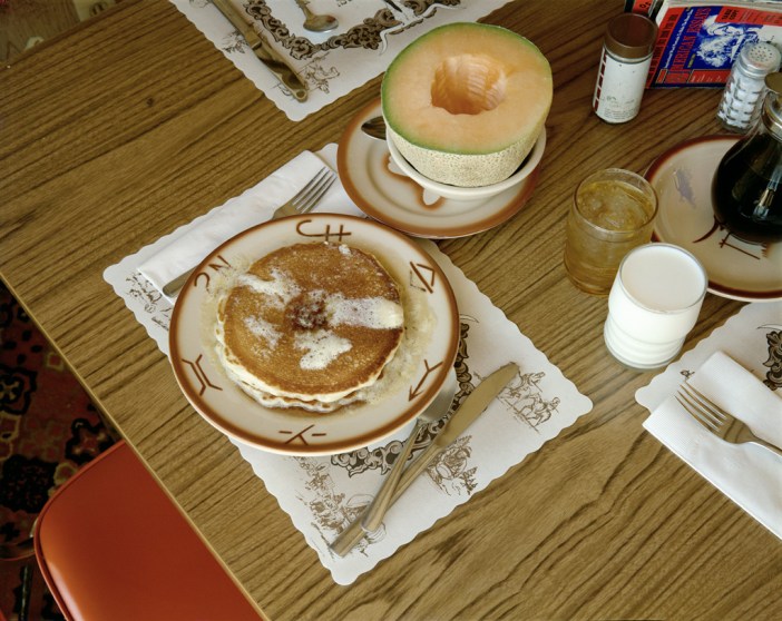
, January 16, 1981")


 “Transcendent documents” is how